Jun 29, 2021

Claude Monet, Ross King, and his Recent Book "Mad Enchantment"...

Before reading about Claude Monet's water lily paintings, I am teaching a terrific plein air workshop in Sicily this fall. Italy is now open so we can eat some great pasta, drink some good wine, and paint some beautiful sun-drenched pictures!  

For more information, download my pdf brochure below...

October, 17th - 24th, 2021
Ross King and his Wonderful Talk on Claude Monet for Oil Painters Of America...

Here is a special treat from the folks at Oil Painters of America. 

They invited celebrated author and art historian, Ross King, to talk about Claude Monet and his large waterlily paintings which now hang in the Musée de l'Orangerie, in Paris. The paintings are the subject of his recent book, Mad Enchantment: Claude Monet and the Painting of the Water Lilies, a book which presents a fascinating tour of Monet's late life, and his final obsession. 

This lecture is well worth the 90 minutes it takes to watch, and remains accessible on the Oil Painters Of America's website. It is free to watch here at www.OilPaintersofAmerica.com

Or use this direct link: https://tinyurl.com/MadEnchantment

And if you are a representational painter, consider joining Oil Painters of America. It is a great association filled with all levels of artists from all over the world.

And finally, Ross King is also the author of many other books on Art & Culture, among which is one of my personal favorites, The Judgement of Paris: The Revolutionary Decade That Gave The World Impressionism – all of which may be found here: www.rosskingbooks.com

Mad Enchantment: Claude Monet and the Painting of the Water Lilies
Pub: Bloomsbury Publishing USA
Length:416 Pages

TJK

–––––

Here is a short trailer I created to entice you... enjoy!


Jun 14, 2021

Studio Lighting for Painters...

Well clearly, it has been a long time since I posted, so here's something new!... But before I begin, I want to share I am teaching an awesome plein air workshop in Sicily this October, 17th - 24th, 2021. Italy is now open so we can eat some great pasta, drink some amazing wine, and paint some beautiful sun-drenched pictures! 

Studio Lighting for Painters

I am largely known as an observational painter, an artist who prefers to work en plein air whenever possible, although I do paint a fair amount in my studio. Sometimes from a still life or model, and sometimes from a monitor. (gasp!)

Yes, a monitor... 😳

I started off as a commercial illustrator, which has probably damned me to Fine Art Purgatory at the least, if not Hell itself. But as a result, I have no strong feelings about remaining artistically pure in any sense of the word. However, having confessed to my earlier sins, I do recognize the need to train one's self by working directly from life as much as possible. Painting from life hones your observational skills. Abilities which cannot be developed from looking at a photograph print or LED screen.

But I am posting this to share information about lighting your studio space, not argue about whether or not working from a photo is a sin. I'll leave that debate to others instead.

Most of us have turned part of our home into a studio...

It might be a corner of the kitchen table, or an entire floor of your house. In the beginning I lived in a tiny one-bedroom, second floor apartment and I use the small living room as my workspace. I didn't have a sofa, sitting chair, coffee table because they interfered with the easel. And as a young single artist living that way wasn't a problem. I could read in the kitchen or watch television in bed. But the idea of having to make do such a tiny space now, alone or with another person – let alone another artist, which I did – seems crazy now.

I am better off in my current studio. I may wish I had more room, with north facing windows – and I once did have such a space. But I had to vacate it when the building it was in was turned into an indoor growing-operation after weed became legal. (Pluses and minuses, right? 😁) I eventually ended up buying a mid-century modern daylight ranch on a slope with a large family room downstairs and that daylight basement works pretty well for me now. I still might wish for more space and north windows, but I am largely content with what I have.

However, the light in my studio sucks. There is a twelve-foot row of 60 inch windows along one wall so there is plenty of light. The problem is the windows face southwest, which means the natural light changes dramatically over the course of the day.

So what to do? Beyond turning my studio into a dark cave by shuttering the windows?

Supplement the Light...

Lighting has come a long way since my first apartment. What once was unacceptable is now easily fixed with our new lighting tech.

I used to hate LED lights and refused to use them in any way. Not on the house, not on the Christmas tree, not for reading, whatever. To me, LEDs felt cold, hard, and brash. The kind of light that sucked all the warmth and romance out of my work. But LEDs have changed. We can now buy (relatively) inexpensive color-corrected, full-spectrum lights in a wide range of formats and temperatures. You can find temperatures from 2700k (which is similar to a 100 watt tungsten bulb), to 3000k, 4000k, 5000k, and 6500k LED bulbs. All with form factors which can be inserted into standard sockets and fixtures.

But LED specifications are still new and confusing to many painters, which can make it difficult to choose the right ones to augment the deficient light in your studio.

So let me describe my studio space...

Approximately 17 by 35 feet.

A single bank of 120 x 60 inch windows facing southwest. (Aaaak!)

Two hard-wired ceiling fixtures towards the opposite ends of the studio, on a single wall switch.

A ceiling height of 8 feet, 4 inches. (An important point to consider when designing your lighting set up. This is low for good studio lighting.)

Oh, and lately, I've been sharing the space with my wife, who is painting again after many years.

A long shot of my entire studio. In the foreground are tables and areas dedicated to painting the still life and indoors instruction. To the left is the large bank of windows with various screens used to control the outdoor light. My painting area is at the back, where I work from a monitor. And in the mid-ground, a fireplace that make everything so cozy I never want to leave. Oh, and my lovely wife and our two dogs as well. It is nice to have visitors every now and then...


My primary painting area: The panel on the easel is 30 x 40 inches and the monitor behind it is a fairly new  55-inch 4k Samsung with a reference image thrown onto the screen directly from my laptop.

My Current Lighting Hardware:

Two daylight balanced 3000k LED bulbs in two ceiling fixtures. Both are on a dimmer switch so the lumens may be adjusted as needed. A total of 4 bulbs. Note the two different colors used to reduce the temperature bias. (I often view a painting only under these lights because they represent the temperatures and lumens found in most homes.) 

One 48 LED tube inserted into a cheap light fixture. 
The light hangs 8 inches above the top mast of my easel and slightly out front. With older lighting technology this would be an insolvable problem. But the LED light tube is so diffused it feels as if the light is coming down from a light well ten to twelve feet above my head. It provides a beautiful even wash.

I also have two adjustable LED easel lights purchased from ArtEscape.us. (Image courtesy of Douglas Woodman, inventor and purveyor of a fine easel lighting system. I use these lights for painting nocturnes but also to illuminate an indoor still life or model. I have 10, 20, and 24 inch light bars that connect to long-running battery packs, or switched cords that can be plugged into a socket for continual power. The temperature and lumens of these lights are widely adjustable so I can match to the light found in any nook or cranny in the studio, which increases the useful space by a large margin, or I can dial in a complementary color temperatures as a teaching tool.


48 inch ArtEscape Light Bar clamp to a large easel.
Photo and painting courtesy of Doug Woodman.

👉 QUICK TIP: If you are just looking for a quick and easy solution for your easel then I recommend ArtEscape's LED light tubes. They can illuminate a canvas from a 6 x 8  to a 36 x 48 inches. Even larger, actually. (In fact, since every light is hand made Doug would be happy to custom build you any size light. His lights may seem pricey but they provide you with a simple and immediate solution. I guarantee his light(s) will improve your experience at your easel.) Doug is literally a rocket scientist, now retired, and he paints like you. You simply clamp his light on, plug it in, and start painting.


But how can you find a good lighting solution?

Let's start by defining a few important terms. Once you understand them you can decide what will work in your studio.

Day-light Balanced Bulb: A term used by manufacturers to claim the color of their light matches the color of the sun at noon on a clear day. Technically, this spec usually runs between 5000k and 6500k – 'k' being a symbol to indicate the Kelvin scale. The Kelvin scale is used by physicists to quantify the visual temperature of a light source. I originally installed 6500k daylight balanced LED lights in my studio but decided the 6500k threshold was too cool for painting indoors and collectors will almost always display the artwork they own under warmer lights.) So the term "Daylight Balanced" is not all that helpful since the temperature of the light can be what is claimed, yet the light can still be deficient in multiple parts of the spectrum.


👉 CRI Index: A more exact term to use to evaluate the suitability of a light for your studio. CRI stands for 'Color Rendering Index" and any number of 94 or above can be considered suitable to work under. A CRI of +94 means the various colors of the spectrum are equally balanced so there will be no bias in the light to disrupt your sense of color. (Google the term metamerism if you want to learn how the appearance of a color changes under different lights.)

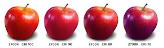
https://en.wikipedia.org/wiki/Color_rendering_index

LED lights commonly come in a range between 2700k to 7200k, although I wouldn't recommend anything below 4000k or above 5000k for your studio. In my experience, both 4000k and 5000k are a decent compromise between the temperatures you experience outdoors and the lighting you find in most homes.

👉 Lumens: Lumens quantify how much light a light source emits. We once used watts to describe the brightness of a bulb but this has changed due to the new kinds of light now available. To put it simply, the higher the lumens, the stronger or brighter the light.

https://en.wikipedia.org/wiki/Lumen_(unit)

It is easy to over light your studio just as it is easy to accidentally set up your easel outdoors with the canvas pointed too directly at the sun – a situation that is guaranteed to turn your beautiful plein air painting into a black hole when you bring it indoors. So my advice is to match the lumens that fall on your studio easel with the lumens you find in most homes lest you end up painting a black hole in your studio as well. I started off lighting my painting space with two 48 inch light bars but removed one of them because the lumens were too much. I was creating black holes on the easel as well.

Ooooh, look at all those beautiful colors going down the drain and into a black hole!... 😉


But what about painting from a monitor?...

There are a few tricks to setting up a monitor in your studio. In addition to supplementing my natural studio light with LED technology, I have a new 4k 55-inch HDTV mounted to the wall on a 30 inch folding arm. (The 4k refers to the pixel resolution of the monitor and has nothing to do with the temperature of light.) The HDTV can be pulled over to my easel and angled for easy comparison. The swinging wall mount also allows me to rotate the screen 90 degrees for when I paint a vertical canvas. The monitor turns without a need to unscrew, unlock, or reset anything. I just reach out and rotate it. It's a nice feature to have and worth the extra $$$. This HDTV has wifi built-in so my references are transmitted directly from my laptop as shown below.

Something to note:
Since the HDTV is not a computer monitor my ability to calibrate its screen is limited. So I set the HDTV to its factory default of 'Natural' and tune the reference image for pleasing color from my laptop. The image may look awful on my laptop but I don't care. It is how the image looks on the big screen that counts.

And speaking of painting from a monitor, it is important to balance or equalize the lumens of the light on your canvas with the lumens coming out of your painting monitor. You also do not want the area around the monitor to be too dark or you may have difficulty gauging the values and colors in your reference. So make an effort to balance both areas of light.


And finally, I have hung curtains in such a way that they can be opened or closed to eliminate reflections from windows or lights elsewhere in the studio. It is a good to plan out your workspace before buying the hardware. And know that even if you do plan well you will probably still need to tweak things after everything is installed. If only to make the painting environment perfect! 


Supplier Links...

The 48 light bar above my easel:

I am using one D50 5000k T8 LED Tube Light.

The ArtEscapes Easel lights

If you have questions about anything in this post please don't hesitate to ask. I'll be happy to respond!

TJK

_____________

And remember, I am teaching a fantastic workshop in Sicily, October, 17 - 24, 2021. Among other helpful things, we will focus on the temperature of light and how to add it into the light and shadows of your paintings to create life and atmosphere. This will be one of my best workshops ever!

Registration now open!...


Apr 12, 2021

Color for the Plein Air Painter...


As promised, here are the two contemporary palettes I refer to in my recent 42 minute video, "Color for the Plein Air Painter". (Video will be presented at this year's PleinAir LIVE.)


Version A is close to what most of the French Impressionists used at the end of the 19th century – with the exception a few substitutions made for reasons of health & safety, expense, and availability. Paint with Version A if you want to experience the closest match to what Monet, Pissarro, and their peers used.

Version B can be considered a decent contemporary counterpart to the Impressionistic palette – with the main difference being its colorants express a much higher chroma (intensity); and as such, they are colors capable of encompassing a wider range of hues. However, since these contemporary colors are so intense, mixing and controlling your tertiaries and neutrals can become more difficult. If you choose to paint with Version B I recommend you pre-mix a few grays to feed into your purer hues to lower chroma. Also, this contemporary palette is almost entirely transparent so if you need to adjust the opacity of your paint you must use the white and the black listed.


Feel free to download and share this graphic with all of your friends with my blessing – so long as you credit me and include my website URL and the copyright information.

And here is a brief teaser for my 42 minute video on how to mix color. It is just the opening mood setter. I plan to expand upon this video soon and offer it as a stand-alone lesson on how to see, mix, and intentionally manipulate color for artistic effects. Look for it sometime in the next few months.

Enlarge this video for the best viewing. If you don't see the preview click https://youtu.be/0d0PByxCbaM to watch it on YouTube.


If you want to be among the first to see the entire video you can register for this year's PleinAir LIVE. It will broadcast on Friday and I will be there in the chat room to answer any questions you might have. Here is a link if you wish to register. 


Using the link above will do me a favor as I will receive a small percentage of your registration fee. Which I will put towards an expanded version of the color video...

That's it, until next time!

TJK


Mar 16, 2021

Color for the Plein Air Painter: How to See and Mix Color

Color for the Plein Air Painter

Hello All:

Here is a short teaser for a 42 minute video I just produced. It will play in Hi-Def in its entirety during PleinAir LIVE 2021. In this video, I will demonstrate how to see and mix the colors you need in oil. If you want to see the full video you may do so by registering with PleinAirLIVE 2021 below:

If you use the link above to register, you will help me out, as I am affiliated with the folks running the show, and part of your registration fee is shared with me; which means I can make more instructional videos and offer them to you. So I thank you ahead of time if you choose the link above. 👍 ♥️
Many great outdoor painters are participating. Just review the line up. Many are friends and peers, and there are many I'd be happy take a class from. So no matter what your level may be, this year's PleinAir LIVE will be a fantastic way to launch your 2021 plein air season.

Take care, be safe, and have fun!

Aug 7, 2020

Now Offering High Quality Online Painting Workshops!...

 Hello All: 

Wow, this blog has gone well past the million visitor mark and somehow I missed when it happened. Thank you for all your support!

Some more news: I want to share I am now teaching online from my own studio.


I've spent the last two months setting up and refining a multi-camera system so I can switch your view between my painting, my palette, and myself – all under color accurate studio light at high definition. As a result, this new way of teaching is going well.

The upside to teaching online is people like you from all over the world can now easily work with me individually or in a small group. I've set things up so you can register yourself for any class you want, and you can talk ask questions as we work together. As if we are in the same room.

No chat boxes or typing, just talking like normal people. Real-time back and forth conversations.

My goal is to keep these classes small and intimate. I am not interested in broadcasting to a large passive group. I'd rather work with fewer students at a time knowing I can zero in on your interests and aspirations based on what you are telling me.

I've set up a new website to host information about my online classes. Here is the website URL. 

www.OnlineArtWorkshops.com

Please bookmark the URL and visit often as I will be updating it every month. I also plan to repeat the most popular workshops that fill up in case they max out before you can register.

One of the nice things about  teaching online is that I can ask you to suggest instructional content. If there is something specific you would like me to focus on please email me and I will try to work it into the curriculum. I want this experience to be as accessible as possible, for you and the friends you will make as we all work together.

__________

Also, if you haven't done so already, please subscribe to my Early Bird Workshop Notification List. You can do so here by click on this blue palette. Once you do you will hear about all the workshops I offer, online and in real life. Subscribers hear about my workshops first and often receive incentives for early sign-ups.


New work:

:
First Thaw, Paulina Creek Falls, Central Oregon USA
18 x 12 inches, oil on linen, largely alla prima
Recent demo for my Falling Water workshop (see below)
• Available for Purchase •


Here are August's workshops briefly summarized. Visit www.OnlineArtWorkshops.com for more info or to register. Class size will be limited to eight students...


1. August 12th – Mixing Greens for the Landscape Painter – I don't know about you, but almost every gallery owner I have worked with has told me the self-fulfilling prophecy that greens don't sell – even as I turned around to watch a green painting go out the door. (Don't agree? Re-read the self-fulfilling part.) In this workshop, I want to show you how you can learn to see, mix, and paint green in a way that won't look noxious and acidic, or worse, dull and lifeless...


2. August 19th – Painting Rocks – Rocks can be big, small, sharp, and rounded. They are often sheared off or broken, and weathered by powerful natural forces. They can be strewn about or clumped together in an arrangement that tells you about the quality of light and environment you are painting. Such characteristics can be used to turn a ho-hum composition into a truly magnificent design. So join me as we talk about such things and I paint various kinds of rocks...


3. August 20th – "Falling Water" Back by popular demand, the demo is shown above – Just like rocks, water is fundamental to the dedicated landscape painter. Yet, it can become maddening, if not crazy-making, to capture the turbulence and flow of water as it twists and turns over a drop. But capturing such dynamic characteristics become easier once you understand a few tricks. And I promise to show you some of those tricks, or all of them, if you want to learn them and time allows...


__________

I am truly excited about this new way to teach. I'll still lead destination workshops once we start traveling again, but being able to study right now in the comfort and safety of your own studio with this new technology is awesome. Come join me!

And as always: Stay safe, stay healthy, and keep painting!

Thomas


Dec 10, 2019

"There, I fixed it..."

Yes, unless you've been living under a rock, or fail to have WiFi in your studio, or hate TV and social media, or your fellow man – the art world has been going bananas over a couple of bananas – at Art Basel Miami...

https://www.washingtonpost.com/entertainment/museums/the-art-basel-banana-was-art-and-the-peals-of-outrage-were-one-layer-of-it/2019/12/09/bb785b10-1a91-11ea-87f7-f2e91143c60d_story.html


And...

https://www.usatoday.com/story/life/2019/12/09/banana-priced-120000-exhibit-art-basel-eaten/2628306001/


But there, I fixed it...


(with apologies to Peter Paul Rubens...)


Nov 3, 2019

PLEIN AIR SICILY 2020 Workshop: Painting the Intensity of Light and Color...


PLEIN AIR SICILY Workshop
May 16- 23, 2020

This will be one of my premier workshops for 2020!... Watch this video to see what your week can be like – painting, eating, drinking and touring like an Italian, and yes, soaking in some sun after a long winter. So come join me and have some fun, and learn a lot while you do!...


Enlarge to full screen or click here to play on YouTube...


Why Sicily? It seems so far away. Why go all the way to paint there?...

Well, because of the light. The sparkling clear, vibrating light.

Sicily, and specifically the area we will paint in, is at the very bottom of Italy. Far to the south and out to the west, Marsala is the nearest town. Low in latitude, at the tip of the boot, the toe juts far enough out into the Mediterranean to make the area feel like an island. This means there will be brilliant light from above, and crystalline water for the light to bounce off of. The water itself is clear and shallow, and when you look into it you can see the same limestone rock beneath the surface as you do along the cliffs above. 


This is a perfect place to learn how to paint the color of light en plein air... The cliffs exhibit bright yet subtle variations of white and off-white colors, and all those high-key values keep the light bouncing around and around. All this light fills the shadows you see with color and it is a magical thing to paint. There is no such thing as a 'black shadow' in Sicily.

The subjects we paint encompass classical history – including some of the best preserved Greek ruins you will ever find outside of Greece. We will paint intimate village alleyways, centuries-old salt pans with traditional windmills pumping water in and out of those pans. We will paint colorful working fishing boats drawn up upon the shore, open air markets, and perhaps even local people in traditional dress if it can be arranged. We will take a day trip up to the ancient mountain village of Erice (el. 2460 feet) and paint glorious views over the entire peninsula.

And the food, the food!... 


The food of Sicily is famous world-wide for its flavors, sensations, and textures. It is an incredible conjoining of things from sea and land. The combinations can't be described, they must be experienced. Much of what you think of as Italian cuisine is actually Sicilian. So why not go directly to the source? (No slight intended to the Italians to the north, but the best meal of my life was Sicilian...) And the wine. Not well known, but among some of the greatest varietals are grown here.

And your lodgings? Well, Salinara speaks for itself. An old villa, long a destination for many artist groups, has been beautifully maintained with love, care, and attention to detail. It too offers many opportunities to paint on site. There are intimate vignettes within the walls, and distant views from above, all from on the grounds, just a few feet from your room. Or you can just lounge between our daily painting excursions and relax in your private space, or by the pool, or in the kitchen.

Your accommodations are all-inclusive: breakfast, lunches, and dinners prepared for you by the owner, an incredible chef. There is no need to rent a car. We will pick you up at the Palermo airport and transport you to wherever we go. Then we will take you back to the airport for the next part of your journey.

This will be the best of Sicily delivered to you in a week... 


I promise to make it one of the most amazing painting excursions you've ever experienced. By the time you go home your paintings will be filled with light and color, your mind with history and lore, and your belly with good things to eat. Memories for a lifetime.


Registration is open now. Contact me directly for more information. Or download this free pdf brochure.


But don't wait because this workshop is filling up. Send me an email at workshops@thomaskitts.com and I will respond!...

Until then, la dolce vita!...

Thomas


Jul 23, 2019

Sorolla's Color Palette – Outdoors, from about 1905 on...

Sorolla's Outdoor Palette


Below is a pdf that lists the outdoor color palette preferred by Sorolla from about 1905 on. It also offers a few contemporary alternate palettes you can use to achieve similar mixes.

I am posting it for you, my loyal blog readers, and for those in Ireland who will be attending my upcoming 90 minute lecture on Sorolla and his outdoor methods, during Wexford's 2019 Art in the Open.


Joaquín Sorolla: Painting Techniques Of A Spanish Master
August 4th, Wexford, Ireland


Enjoy, and keep painting!...

TJK


Apr 16, 2019

Remaining 2019 Workshop with Thomas...


Hey All:

Just a quick reminder about the remaining workshops I have scheduled for 2019...


Visit my workshop page for more info: 

(Detailed PDFs for each workshop are downloadable at the link)

Also, if you are specifically interested in my upcoming Monhegan Island workshop – what will be my show piece for 2019 – please be aware that after June 24th the rates for your lodgings go up, the selection may go down, and reservations will become more difficult to find.

Most of the others are over 1/2 full and one is almost max'ed out...

TJK


Feb 25, 2019

Berthe Morisot and her Brushwork...


I received an email today requesting me for a quick take about how Berthe Morisot painted. I thought my reply might be interesting to you readers, so here it is...

On Feb 25, 2019, at 11:36AM, Malcolm wrote: 
19911537896_483614173a_b.jpgMr. Kitts,

I received your email this morning about the micro and macrocosm of your painting brushwork and enjoyed the video. Very nice surfaces!
This evening I will purchase, and watch, your ‘Sergeant' video and hopefully that video will answer a question that I have about gestural brushwork.

But in case it does not I am also sending you this email to ask: in the attached image of the Berthe Morisot painting the brush work is very loose and superimposed over other brushwork, what medium (if any) would she have mixed with her oils to achieve those flowing strokes? They are fluid and almost translucent in areas.

And my reply...

Hello Malcom. Thank you for your email.

First, the recent Video Demonstration you mentioned focuses exclusively on Sorolla, not Sargent. Just want you to know that before you purchase it. But that Sorolla demo is more in line with the way I painted the Micro/Macro Five Palms painting than any Sargent methods. In fact. I was sticking pretty close to Sorolla’s mature technique as I painted it. And yes, there will be a comprehensive Sargent DVD demo as some point. I just haven’t scheduled it yet.

I don’t consider myself an authority on Morisot per se but I can make a few educated guesses based upon what I know about the materials and methods in use at the time. Although, it is important to understand that very few artists worked the same way, with the same technique and materials, over the entire course of their lifetime. So the conclusions I draw here should be considered merely quick generalizations, and not encompassing in how Berthe always worked…


Berthe Morisot, The Artist's Daughter Julie with her Nanny
click to enlarge

First, I have attached a large jpg of a different Berthe Morisot painting (above). It was probably executed close to the time of the painting you shared. You should be able to zoom into this file and see distinct layers of paint, which may help answer your questions. (I have even larger files, but this image should suffice.)

And please remember, the following observations I have offer below refer to the image above, not the one you attached to your original email to me...
1. In both of these examples, Berthe was painting on a tightly woven linen support. The linen would likely to have been ‘gessoed’ with a lead oil ground, a common practice at that time and it is a nice surface to paint on even today. Try it yourself. Your ground will dictates what happens with your brushstrokes. 
2. The prepared ground was stained with a pigmented earth color, likely a burnt umber from the look of it. The wash would have been applied thinly using a solvent, likely turpentine, and left to dry before starting the painting. I say dry because there is no softening or diffusion in the lower layers of paint that sits directly on the ground. 
3. The paint pigment itself can contribute to the character of her brush work. Berthe is painting with a palette used by most of the original French Impressionists of this period. Cad Yellows to Reds, and I am guessing Prussian and Colbalt Blue, a Viridian or Emerald Green, and a few assorted earth colors such as Umbers, Ochres, and Siennas. And she was definitely using a Lead White. No black. There may be additional pigments involved as well, but if so they aren’t obvious to the eye and it would require some lab tests to determine what else is there. But largely, it is the lead white that is facilitating the thick ropey impasto character to Berthe's marks, and the drags, pulls, and the way the paint breaks at the edges and ends of her strokes. 
4. Look at how the paint is applied. Either as a few thin washes (underneath), with little attempts to model form (except in the hair), or it has been applied is thick and full-bodied, with each stroke retaining its individual character and gesture. Not a lot in between. I see no visible slumping of the impasto as it set so there probably isn't any fatty oil or medium incorporated beyond whatever may already be in the paint itself. Again, this would be a common way of painting for the French Impressionists because most of the leaders of that movement eschewed a glossy surface or overly mixed their colors. They felt such practices detracted from the optical partitive effect they were pursuing. They liked to allow flecks of pure color sparkle amongst the other mixes, sometimes analogous, sometimes complementary, unlike the academic painters of the same time who tended to mic 'dead' color and or glaze over underlying hues. The French Impressionists, such as Berthe, also likely to push one wet pure color into another on the canvas, rather than mixing everything with a knife on a palette. (Variations of this abound.) And, in the child's lacy collar you can see a ‘double-loading’ where Berthe picks up two colors on her brush before dragging it across the surface. An entirely different kind of blend. This was also common to impressionists of the period. 
5. Berthe is using a stiff haired brush, likely hog hair, and even more likely, a combination of few different-sized filberts or short stubby flats with grounded corners. She applies restrained touches of color with small round every now and then for the fine details, such as the eyes and eyebrows, but she isn’t using the small round to render out or ‘detail' things like hair or drapery. All of that are big gutsy pulls with a loaded brush. 
6. And finally, look at the directional gesture of her strokes. She often pulls them in alignment, sometimes changing the direction to follow along the surface planes of her subjects – look at the shoulders of both figures – and sometimes simply pulled along the side of a flat shape, like the side of the mother’s face. Other times her strokes are short and multi-directional. Both contribute to the activity you feel on the surface. The French Impressionists often used such brushwork to convey the crisp sparkling of light. 
Conclusion: So on a quick review, based on this painting and others I have seen first-hand, I don’t think Berthe used much painting medium at all, beyond a little turpentine at the outset. I don’t see any evidence that turps were used towards the end since the nature of the strokes on top belies it. With one exception being the isolated brilliant cobalt or ultramarine blue strokes representing the nanny's left wrist cuff. That is clearly an improvisational turpentine wash of pure color on top of dry paint below.
And in your opinion would that painting be completed in one sitting or over many days? 
Both paintings look as though they were executed all prima, or completed within a single session. Perhaps there may be a few areas that were further worked after the initial paint layer had dried, maybe as corrections, but given how the layers of paint ‘break’ and overlap those re-workings would be minimal. And there is no sign of Berthe working fresh paint into or on top of an ‘oiled out’ area, which is how some painters of this era made multiple session paintings look as if they were a one-shot wonder...

Malcom, I hope this information is helpful as you continue to study Berthe Morisot. But be sure to look at as many original paintings by her as you can find. 

And of course...keep painting! 

TJK

_____

And for those interested in practical painting lessons:

Workshops!... Workshops!... Workshops!...


It's that time of year when some of you look for Summer and Fall workshops. Click here to learn about my upcoming classes with detailed downloadable info. But don't delay, most classes are about half-full as of this posting.